The words inside the interface
In-app writing on the Content Design team at General Motors: the notifications, instructions, and screen text people read while they're using the product.
In-app content
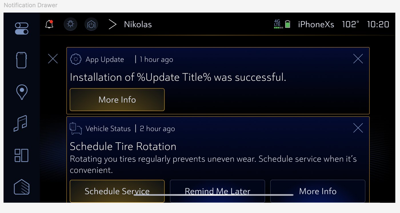
On the Content Design team at GM, I write the text people see while they're using the product: instructions, configuration screens, feature descriptions, notifications, and alerts. All of it follows our style guides and the in-vehicle interface standards.
It has to be right the first time, since there isn't much room for confusing text inside a car. Over the years I've often been the person teams come to when the writing needs to be right, getting pulled in by QA and product managers to fix copy quickly.
An app update experience built around local regulation
The project
I worked as the Content Designer on a project to create an app updater experience for vehicles in South Korea. My design partner and I worked closely together to accommodate shifting requirements. A unique experience had to be created to make sure we adhered to government regulations for updating apps for customers in South Korea. We tried to make the experience as streamlined as possible, and to keep as much consistency as we could with our other in-vehicle designs and content.
The screens
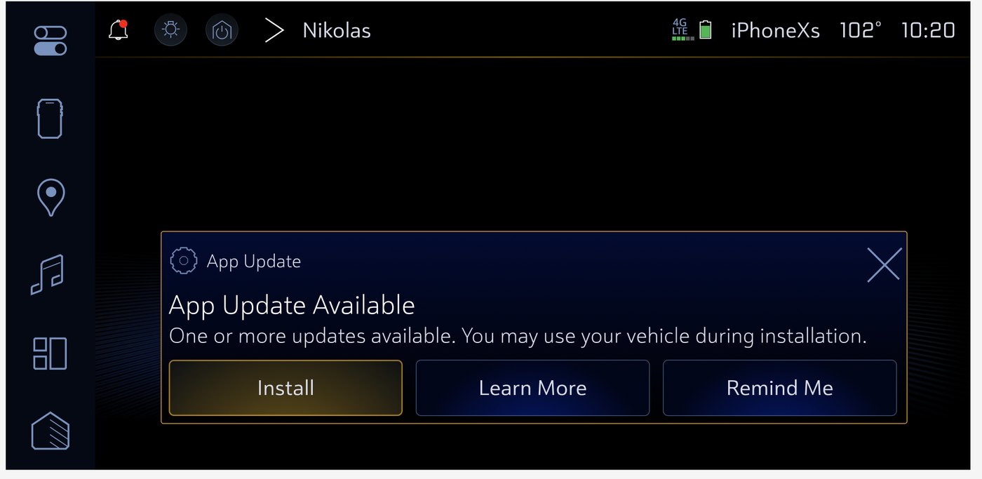
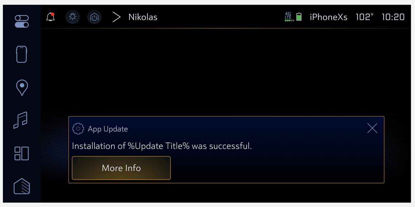
It was important to tell the driver they could still use their vehicle while this type of update installed. Regular over-the-air vehicle software updates disable the vehicle while they run, so this needed to be called out clearly.
This type of update was designed so that if several app updates were available, they would all install together. There was intentionally no option to select individual updates.
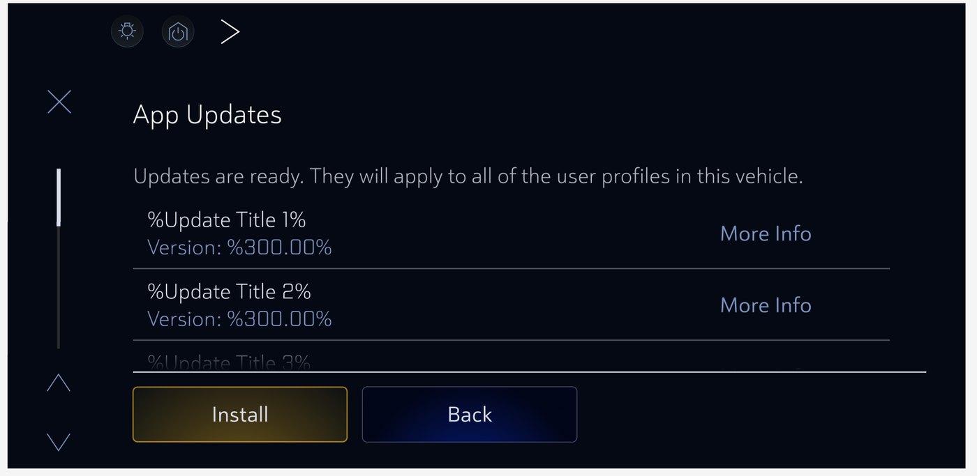
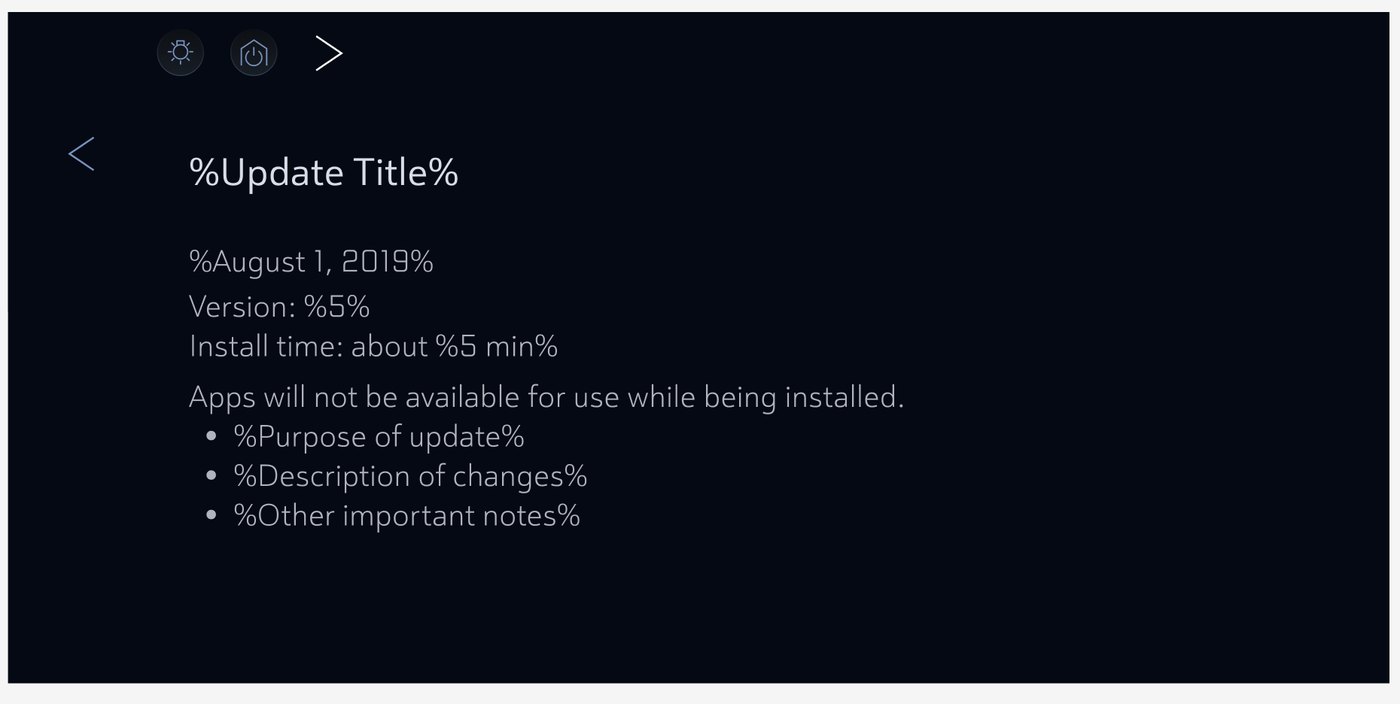
This is a mock-up of the page customers would see with release notes if they selected More Info for an individual update.
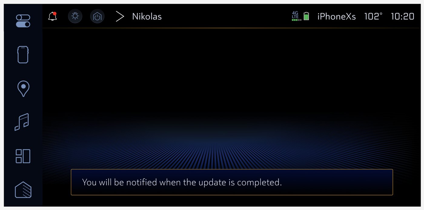
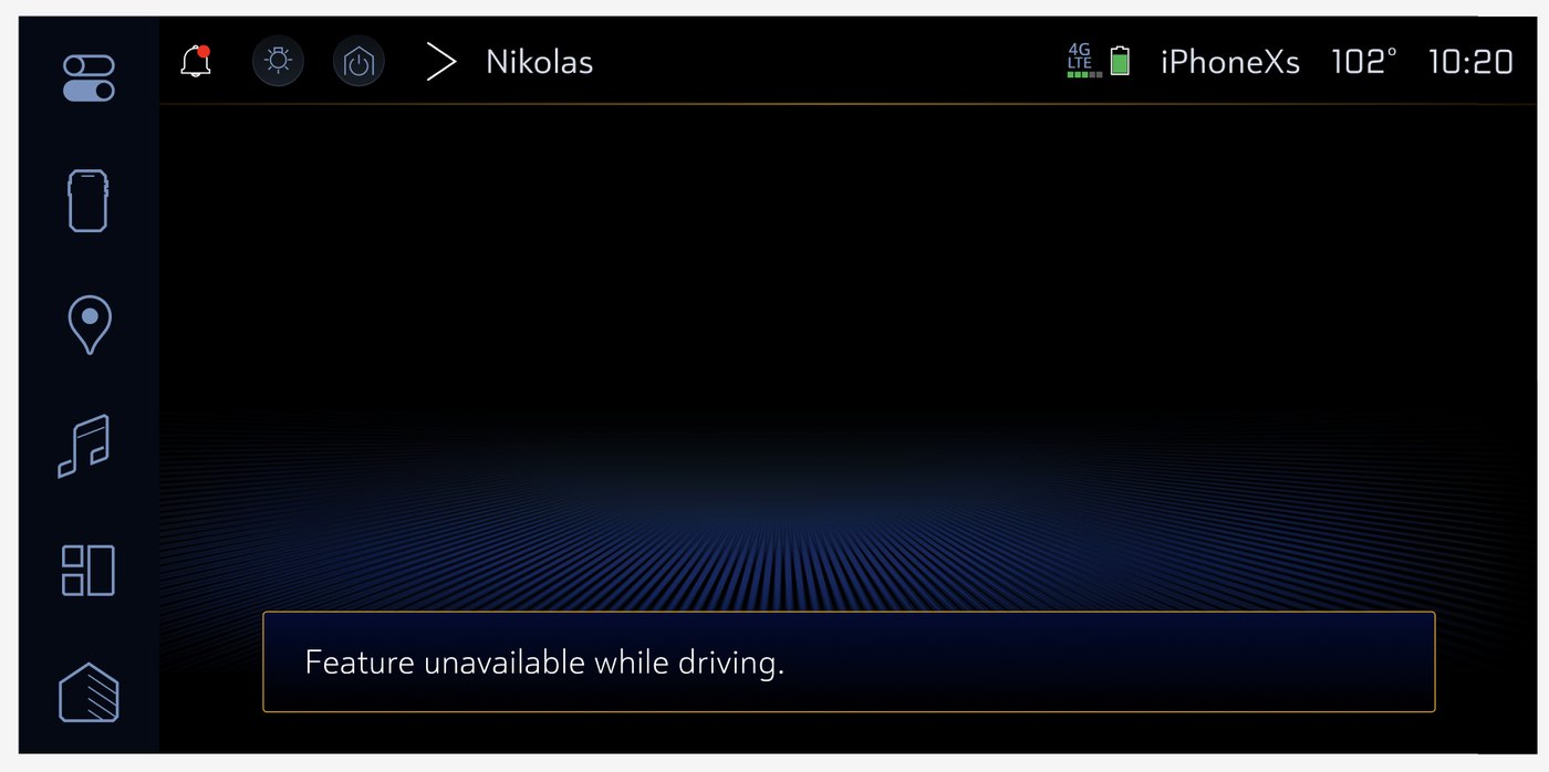
This snackbar message is what the customer would see if they tried to select More Info and view release notes while driving. That screen can't be viewed while driving because of driver workload restrictions.